Sunday, August 11, 2013

Finally! day 30 of 30 - the last post of the last drawing.

This has long been my favorite image of Jesus. It's not my art - I came across it online somewhere years ago.

So many depictions of Jesus are deep, serious, heavy and sombre. This drawing is how I personally like to picture Jesus; upbeat, happy, healthy, thrilled to be in your company and thrilled that you want to have a relationship with him. He looks here like he's pulling for you, believes in you, sees you primarily for your positive traits and thinks you can do it (whatever it is).

This Jesus image is alive, fun and vibrant - someone that is a kick to be around.

I've always been impressed at how much emotion this artist conveys in this very simple collection of broad lines and white shapes. This is good art whittled down to just the critical 'working parts'.


As much as I like the simplicity of this I've sometimes wished for a more finished version of this same pose and expression, so here it is:


I started by blocking in the same flowing solid shapes but then, instead of filling them in solidly as in the reference photo I developed the depth and tone of a more realistic pose.

The '30 day/30 portraits' drawing adventure has been lots of fun! Devoting high quality time to just about anything on a regular basis is bound to pay dividends. It's certainly has been the case for my portrait drawing skills. I still believe, as stated in earlier posts that if you can capture a likeness accurately you can draw just about anything. It feels good to have made much progress towards that end.

Thank you for following along - I hope you enjoyed the adventure too!

Saturday, August 10, 2013

Day 29 - Done in Ernest


One grizzly bearded face deserves another so after learning how to draw beards with Steve Jobs I was eager to continue working with beards on another.

This drawing of Hemingway the novelist came together well using mostly soft pencils and quite a bit of the paper blending tools. I am happy with how the eyes work together. This drawing went fast compared to many others - about an hour.

As the 30 day/30 portrait adventure comes to a close I'll say it's been fun and exciting. It's taken discipline to devote a couple of hours to it every day for a month but the payoff has been much improved drawing skills and confidence. Seeing ability and speed improve is exhilarating.

One last drawing tomorrow for day 30!  Who should it be?? ?

Friday, August 9, 2013

day 28 - a Jobs well done??


This one combined two  reference photos because the first reference photo was cropped at the base of the forehead. Since the photos of Steve Jobs were taken about 10 years apart it was tricky getting the two looks to merge together for one believable portrait. I also left the eyeglasses out at the beginning thinking it might be nice to render him without them but added them later because the glasses turned out to be a very strong identifier.

Thursday, August 8, 2013

day 27 - She or he??

Sitting in a trailer up north with by the light of a battery LED lantern I didn't know what the subject would be.
So I just started drawing a made up face. As a few features fell into place I asked myself if this was a female or male face.  The answer wasn't clear but the path was set for the remainder of the drawing to be an exploration of what makes features be either male or female.

The eye on the left and the lips on the right are more masculine -the eye on the right and lips on the left more feminine. The hair is gender neutral.

Its easy to see the vast difference between the craggy male face of Willy Nelson and the smooth graceful lines of Duchess Kate, But when you go towards the middle from these two extremes the difference becomes very subtle. 

I ended up with this rendition where you can't really say if it's man or woman. In honor of the old Saturday Night Live skit, I'll name this drawing 'Pat', a name that works either way!

Wednesday, August 7, 2013

day 26 - more royalty

Here's another caracature of Kate with her new baby. This was fun and fast, drawn mostly with a soft dark Ebony pencil. Drawing a caricature right after doing a realistic drawing of the same subject is enjoyable because the features are all 'figured out' from the realistic drawing. It's easy to get them in the right place then exagerate them to create the silly look of a caricature.

I threw the sketch of Big Ben in the background just to help viewers place the subject a little easier.


Tuesday, August 6, 2013

day 25

A pretty good attempt at Kate Middleton - Duchess of Cambridge.

This one was a lot of work. I had the eyes out of place and they really didn't work with the rest of the facial features.  One of the best aspects about doing a portrait a day for 30 days is that you really get a feel for how all the elements of a human face come together. It gave me increased understanding of how fascinating all the muscles and bones truly are. All the facial elements need to be working together if the drawing is going to be convincing.

The eye on the left (her right) is in a pretty good place right now but you can see that the paper there is badly overworked, nearly worn out from excessive erasures and start overs. At a certain point the sheet is too frayed up to draw on any more.

This sketch pad contains pretty good paper but not the best. It's doing a good job absorbing the pencil strokes, blending, heavy shading and occasional abuse does have limitations.

Monday, August 5, 2013

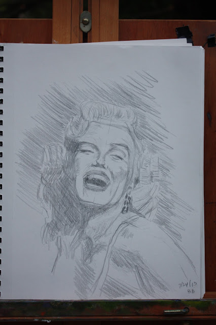
Day 24 - Marilyn

Just a quick post for you tonight.

I did this one about 90% upside down, tweaking just a few things after turning it right side up.


Sunday, August 4, 2013

Day 23 - one more look at Phil..


Here's another (and last) drawing of Phil Mickelson. Its the same pose as yesterday but a much better likeness. The main difference from yesterday's is the tilt of the head is properly established. 

Yesterday's attempt at this pose had the features aligned straight up and down and eyes almost directly side to side:


The reference photo shows quite a bit of tilt in Phil's head. Having this tilt incorrect at the start of yesterdays rendition got it going down the wrong track, causing me to struggle the whole way through. I established the tilt correctly in today's drawing (the marks are still visible) and the rest flowed smoothly. 

These little things are really the big things! If the artist gets the basic building blocks in place correctly at the start there's a great chance of getting a good likeness fairly quickly. Getting them wrong, starting too fast or not noticing  they are wrong leads to frustration, struggle and lots of extra time. 

... Sue will be pleased.

Saturday, August 3, 2013

day 22 - another look at Phil

Since I was disappointed with the portrait aspect of yesterdays full torso drawing of Phil Mickelson, I made another effort today going back to the face only.

I thought this would be easy but I fought it almost the entire way. One of the fun aspects of this drawing adventure is that at the pace of a portrait drawing a day I don't have time to just bang out another if things aren't working quite right. Unless you 'quit' a sketch in about the first 15 minutes you are kind of committed to making the thing you started work out.

I'm not so sure tonight's 'worked out' all that well either. What is it with drawing Phil?? Is it the pressure of knowing that if I don't get it right, my wife (a lifelong fan - not just because of his golf) will be all over me??
I'm blaming that for now!


This is a pretty good drawing but falls just a little short from looking like Phil Mickelson. I actually looks a little more like him in this photo of the drawing than the drawing itself. It seems that sometimes the digital camera can be your friend and make your art look better and sometimes it accentuates the shortcomings.

 Looking at this the next morning with fresh eyes I believe I saw the problem. Nothing new in that! Often after drawing a couple of hours late at night the eye of the artist misses details that fresh eyes would have caught.  I'll share the observation of the problem here in tomorrow's post.

Friday, August 2, 2013

Day 21 - British Open golf champ

All right - not sure if this qualifies as a portrait or not. It's more of a sports art scene. Phil Mickelson inspired me with his dramatic come from behind win of the British Open.

In the reference photo I used you could certainly recognize Phil even though it showed his whole torso and head, but since the head was so small on the reference photo it was tough seeing the details fine enough to render them accurately.

Drawing all the rest of the torso, arms, hands etc. took a lot of time away from concentrating on the face too. it was a bit of a trap! Before I knew it, the evening grew late and I didn't have the time or energy to put the proper finish on that face.

I am glad I gave it a try though. The rest of the golf drawing looks fine.


Thursday, August 1, 2013

day 20 - for those who prefer a more traditional 'Bond'

Hello again!!

Sorry about going dark a bit on these posts. The combination of drawing the daily portrait AND posting proved to be too much so I concentrated on just getting those drawings done each day. I'm happy to report that I DID keep up with the drawings, finishing the 30th portrait last night at 11:50PM on the last day of July. Finding the time each day (1.5 - 2 hours) was challenging but also very rewarding. I often found myself quite pleased to be headed down to our basement studio at 9 PM to start that day's creation. The repetitive time allotted did have quite an effect on the drawings and my ability to see. You may judge for yourself if my skills moved in the right direction.

Now I'll finish the '30 Day - 30 Portraits' adventure by posting a drawing each day, and have the time and energy to write a few insights instead of just throwing up the picture. I think it was a good trade off.

Day 19 was of Daniel Craig - the modern James Bond. The likeness was so so, not one of the best.

Tonight's drawing is for those who prefer their 007 a bit more traditional.


Sunday, July 21, 2013

day 19


Daniel Craig?? ?

Just for fun I began this portrait upside down and completed about 95% of it that way. When I finally turned it over it was exciting. You have almost zero idea how a portrait is progressing when it's worked on upside down so seeing it right side up for the first time is a little bit of magic.

Nice drawing - decent, perhaps not great on the likeness scale.

day 18 - It was his birthday


This pose was a great opportunity to use those paper blending stumps.
It was Nelson Mandella's 96th birthday making his selection a natural.

day 17 - Willie caricature??

OK - since that first caricature experiment of Steve Carell went so well I repeated the process again with Willie. This one did not go as excellent.

In fact this one is kind of a mess! It seemed that Willy Nelson with all his strong distinct features would be easy to caricature but not so for me - at least not this time. I hesitated to even post it but having a few 'clunkers' in the mix - drawings gone bad is realistic and interesting.


Looking at it now, it's not as bad as I was remembering it. As I was drawing this I sort of couldn't decide if I was drawing a caricature or a real portrait, ending up with something in between! I shouldn't be surprised. Since I've only just started with caricatures, my tendency toward doing just a real portrait is much stronger.

day 16


Here's a crusty rendition of country singer Willie Nelson. It was late and I wanted to draw this fast so I thought someone with 'craggy' features might go the quickest. It did work out that way - no need to make someone look beautiful, just locate the features and get them down.

I worked on this one upside down at times. This is a great way to just draw abstract shapes without knowing what they really are. When drawing anything, but especially portraits it's easy (and usually ineffective) to draw our preconceived notions of what things look like. My memory banks tell me that an eye looks like this, mouths like this, ears like this etc.

It's best to just see shapes accurately and get that down on paper, and sometime that is best done when you don't know what you are drawing. Turning the reference photo and sketchpad over makes all those known shapes into abstract shapes. this isn't a nose it's just a pattern of odd shapes and shades. Our minds haven't seen many upside down eyes, mouths and ears so it just gives up on trying to 'plug something in' allowing the artist to simply draw what he/she sees. It's amazing how after doing this you turn the sketchpad right side up again and discover that you've drawn a very accurate picture!

first shot at a caricature = day 15


OK - here's Steve Carell again, this time sketched out as a  caricature. This is my first try ever at a caricature. Caricatures are fun and seem to require making everybody look 'funny'. On some people this is easier than others. I see some caricatures where the thing looks 'forced', where there are not the necessary features to grab ahold of and exaggerate. In the hands of a skilled caricaturist most images are a hoot, and a great way to have a little fun.

This caricature is based on the same post of Steve Carell as yesterday.  I'm not sure if it's Steve Carell or not but I'm very pleased with how quick this went, how fun it was and how natural it seemed to draw this way.


day fourteen


Steve Carell - I grade this about a 'B'. Nice drawing, good proportions but just a so-so likeness. I was capturing a lot of defining features but feel I missed some key ones too. I could work the daylights out of it I suppose and capture more but it was late and I'm making a point of starting and finishing in 1-2 hours/day.

I think I got into details too soon. Once you get off to a nice start it's easy to start right in on the shading and finishing. But you have to take a break, look away for a while then look back with fresh eyes to see if the whole thing is working or not. Often when I do this I notice problems with the overall flow, tilt of the head or the way facial elements aren't quite working together (day two). I think I should have done this one more time with this one.


Monday, July 15, 2013

Back to magazine covers. This reference photo is Of Julia Dreyfes the actor.


This pose went well. I drew it smaller because some portraits use too much of the page as if you are standing ten inches away from the person. This isn't very common in real life. I like drawing big - there is too much tendency to draw real small so big is good but drawing big can be overdone too.

Here it seemed I was starting out quite small but by the time the neck, shoulders and hair were worked in the whole thing fits on the page just right.

I used a new (to me) art tool here too. It's about as old and low tech as possible and I am amazed that I never had one in my hand before. Its a paper blending stick, really just a pencil shaped roll of paper that's tapered like a pencil. you work over and area with your pencil marks on it already and smudge the strokes together. This creates soft blending and transitions that really smoothes out skin tones realistically.

Often I would blend with my fingertip or paper towel but this tool is a lot more accurate and controllable.
It's a lot of fun to use.

Here's a photo of my materials. Pencils of various hardness. Several types of erasures, rulers and the white paper blender.


Incidentally, this whole drawing seemed to be going nowhere at the start. I almost quit it in search of another pose but I kept just working on the thing that was the most 'off', checking position and size and little by little it fell into place - a good lesson

As I look at this post it appears that the subjects head was tilted slightly but I drew her straight up.  It's a small thing but subtle differences like this are what creates the mood and atmosphere of a pose.
Sometimes seeing images on the computer brings new aspects to light. It's a different way of proofing a drawing.

12 - another try


Here's another try at the same subject. The tilt of the head and eyes is much better than yesterdays. The mouth is at a slightly different angle than the eyes in this pose and that seems accurate also.

This reference photo is a bit 'blown out' overexposed making it a little hard to pull out detail. After drawing this pose at least twice now I think that might have contributed to the challenge of this pose. It's difficult to accurately render anything if you can't see it accurately in the first place!

Sunday, July 14, 2013

Eleven

Tonight I returned to the same photo and pose I used in the '4 up' exercise from day six.
This time I'm rendering it with the traditional tools, graphite pencils.


I am happy with this - it's a good likeness but something is a little off in the eyes. I think they are very nicely rendered, but something about the angle of the eyes make this not quite the person in the photo. it's a nice drawing though!

Here is the reference photo used;


Day ten - golf night

Wednesday nights I golf in a two man league. Steve, my golf partner of over ten years and I usually do pretty well and always have a good time. It's a great looking forward to golf night every week of the summer.

So in honor of golf night, here's tonight's subject:


This is Arnie from a magazine cover when he turned 40. It was headlined something like 'the End of An Era', signaling that at age 40, Arnie's playing days were pretty much over. In the current era pro golfers have plenty left in their game well beyond forty. I suppose it's better conditioning that stretches this out a little now.

Also in honor of golf night and Arnie, I drew this one with the golf pencil used during tonight's round. It worked surprisingly well - the lead is soft and smooth, about like a 2B art pencil. It's short length is a slight drawback.


Tuesday, July 9, 2013

Day eight and nine

Here's Fili


And Kili


from The Lord of the Rings. These were very fun to draw because of the rich texture and reference points in there rough personnas.

Unlike day seven with Jewel whose skin and features are very smooth, these two dwarf faces give you something to draw!

The browner tone to these photos is due to using artifical room light (it's dark out now) instead of the daylight of the other portrait photos. Both looks are nice but just a bit different. I am using a tripod now too to snap these so the detail should hold up better when enlarged. They were shot at 1/25th of a second - too slow to hold steady by hand.

All caught up! That's it for now.


day seven - back to traditional

Ok - enought experimenting with materials for a while. My main objective is seeing how much I improve over thirty days and bringing many variables into the mix, such as new materials confuses the results somewhat. I'll probably experiment again but not very much, at least not here.

Here's a portrait from a magazine cover of the singer Jewel. It's a nice drawing but not a smashing likeness. Here's a larger photo:


It's nice, but lets move on. Something funner and better in store the next two days.

Sunday, July 7, 2013

Day six

Tried something different today. I used different materials that required a lighter touch and sketched the same subject four times.


As mentioned in an earlier post I'm usually pleasantly surprised at the improvements made when I draw the same subject another time. For this experiment I drew the same subject (from a large photo) four times, using a large Sharpie marker on a glossy poster board.

This combination of materials forces the artist to draw spontaneously and quickly with a loose style. As you might imagine, there's no 'going back' with an eraser; any mark or line you make is here to stay. I did this without any preliminary guidelines in pencil or anything - just picking up the Sharpie and drawing. the order is:lower right, lower left, upper left, upper right.

You can see that for drawing the same scene these vary quite a bit! Usually when I re-draw, the latest attempt is always the best. While I like the fourth drawing on the upper right, the second attempt (lower left) captured the best likeness!

This is a fun lively way to draw - a pleasant change of pace. I like the slick, fast feel of the marker on the glossy surface but the permanence of the ink on the paper (no changing anything) is a little intimidating! Also I would like to see the four attempts resemble each other closer than these do. It's still early on the 30/30 odyssey so maybe that will improve as I go.

A familiar face..


Ahhh, this subject is a familiar face. Perhaps not so familiar to readers of this blog but it's the most familiar face on the planet for me. This face is me.

With all the drawing I have done I've never drawn a self portrait! Not sure exactly why. I haven't drawn many portraits overall (usually choosing to draw wildlife, sports scenes, landscapes ect.) and when I did it was always someone else.

I enjoyed this though - it was nice having the model (me) pose exactly the way you wanted. I tried several poses, settling eventually on this straight on 'neutral' pose because it was the most consistant and easy to hold. 

I can see why Van Gough created a lot of portraits. If you have a mirror handy, you always have someone to draw.


Catching up a bit

OK I'm doing two posts today to catch up a bit and stay on track for the 30/portraits in 30 day challenge. As mentioned in yesterday's post I've been keeping up on the drawings OK day by day but the posts have slipped a bit over the holiday.

Getting back to a drawing from day two;


This drawing had strong points and also a few flaws. the biggest problem is if you drew a line between the bottom of the nose and the top lip, the two sections don't seem to go together. Part of the problem may have been due to me drawing with the pad on my lap and changing positions.

Here is another shot at drawing the same face from the same reference photo;


I'm much happier with this result. The slant of the eyes and the slant of the mouth are the same, working together in a natural realistic way. 

I had the sketch pad vertical on an easel too making it easier to see the correct angles. 

I'm always pleasantly suprised at how quickly another try at the same subject seems to go. After spending a lot of time on a certain pose I am often reluctant to start again on that same pose. But almost every time I do I'm much more pleased with the result and suprised at how fast it went. Things 'learned' about the subject on the first effort must be in place somehow on the second effort that helps the second drawing progress quickly.


Saturday, July 6, 2013

July fourth

Here we are on the sixth with a post titled July fourth.  I've been keeping up with the drawings but have slipped a little with the posts! The days do come pretty quickly when you try to post something every day. Even quicker when you do a drawing each day. Funny, but so far it seems easier to find time for the drawings than the posts! I had expected this to be the other way around.

So on July fourth there could only be one choice on who to illustrate:


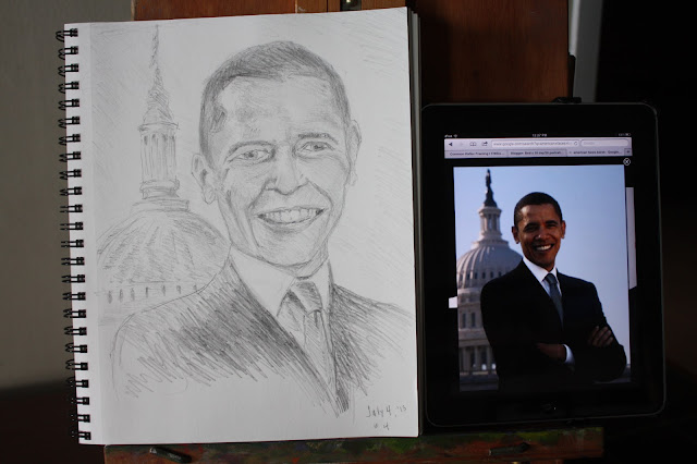
July fourth  - Barack
 I photographed this next to the Ipad I used for the reference photo to give a feel for the size of these drawings and give readers a view of the creative process. you can see that my drawing is much larger than the reference photo and that creates drawing challenges. When the reference photo is small like this it's difficult to observe all the fine details that are vitally important for creating a likeness. the curve of the eyelids, the size of the pupils etc. are difficult to discern. If the pose or the expression is good it may still be worth using the photo though. Someone commented that there may be a little bit  of a 'lazy eye' look here and I think they are correct! It's not too pronounced but the eyes may be looking in slightly different places in my drawing - not on the reference photo.

All in all I am happy with this portrait. I hope you enjoyed the fourth! We had a splendid summer day in central MN.


Tuesday, July 2, 2013

Day two of 30 portraits in 30 days

Here is my second portrait drawing out of 30. This one illustrates a typical portrait drawing challenge; getting all the facial parts and features to work together. From just under the nose up, this looks balanced and good. And from just under the nose down it looks just fine too. But when you look at the two parts together you can see that they just don't fit! 

I think the problem is in the angle of the mouth. Somehow it's not illustrated on the same plane as the top 2/3 of the portrait. Part of  the problem may be that I drew this with my pad sitting on my lap and the subject photo I was looking at was vertical. Plus I may have shifted the pad, possibly crossing my legs the other way at some point which changed the way it rendered. 

Being able to see the problem is the biggest factor in solving it. A lot of times us artists know something just isn't right but are not sure what it is. This time I can see what's gone wrong so there is hope!

I'll try the same drawing again tomorrow with this observation in mind and with the sketch pad vertical, in the same plane as the photo.

Bob


Monday, July 1, 2013

Describing the 30 day/ 30 portrait adventure

Drawing portraits has always been challenging! as an artist you can draw nice looking trees, vases, ducks or whatever and if the finished piece looks nice it's OK.  If you are reasonably skilled nobody is going to say or notice that a certain branch is a bit narrower than you drew it or that the vase came out slightly taller than real life. They take a quick look at it and usually say 'hey that's nice'!

But all that changes when drawing portraits! if you make a high quality drawing of a man's face with pleasant features pretty much skillfully rendered in their proper places but the finished artwork doesn't immediatly call to mind the intended individual, the critical feedback comes very quickly.

"That's not uncle Norm or Auntie Liz! - what are you trying to do here, make fun of them?? ?"
People not only get VERY critical but sometimes offended - as if you tried to mock them by mishandeling their precious features intentionally.

So the high intensity challenges of portrait drawing make it perhaps the most demanding arena for improving drawing skills.

I'm setting out to draw 30 portraits in 30 days to increase my observation and drawing skills. the 30 in 30 aspect adds the extra challenges of discipline and tenacity, sort of like someone who hikes or jogs a bunch of marathons in a row. Drama is created when you wonder if the person has not only the skill but the desire and discipline to see it to the finish.

A new month just started - It's July first 2013. I invite you to join me on my quest to see if my desire for drawing/art improvement holds up and see if my skills improve.

This is also a social media exercise. I invite you to share, comment, post, tweet and whatever else you do to keep in touch with your tribes. From time to time I'll post analytic info., and if you have suggestions on how I can use social media more skillfully, let me know.